Showing posts with label data. Show all posts

Friday, December 18, 2020

Major League Soccer 2019 Statistics

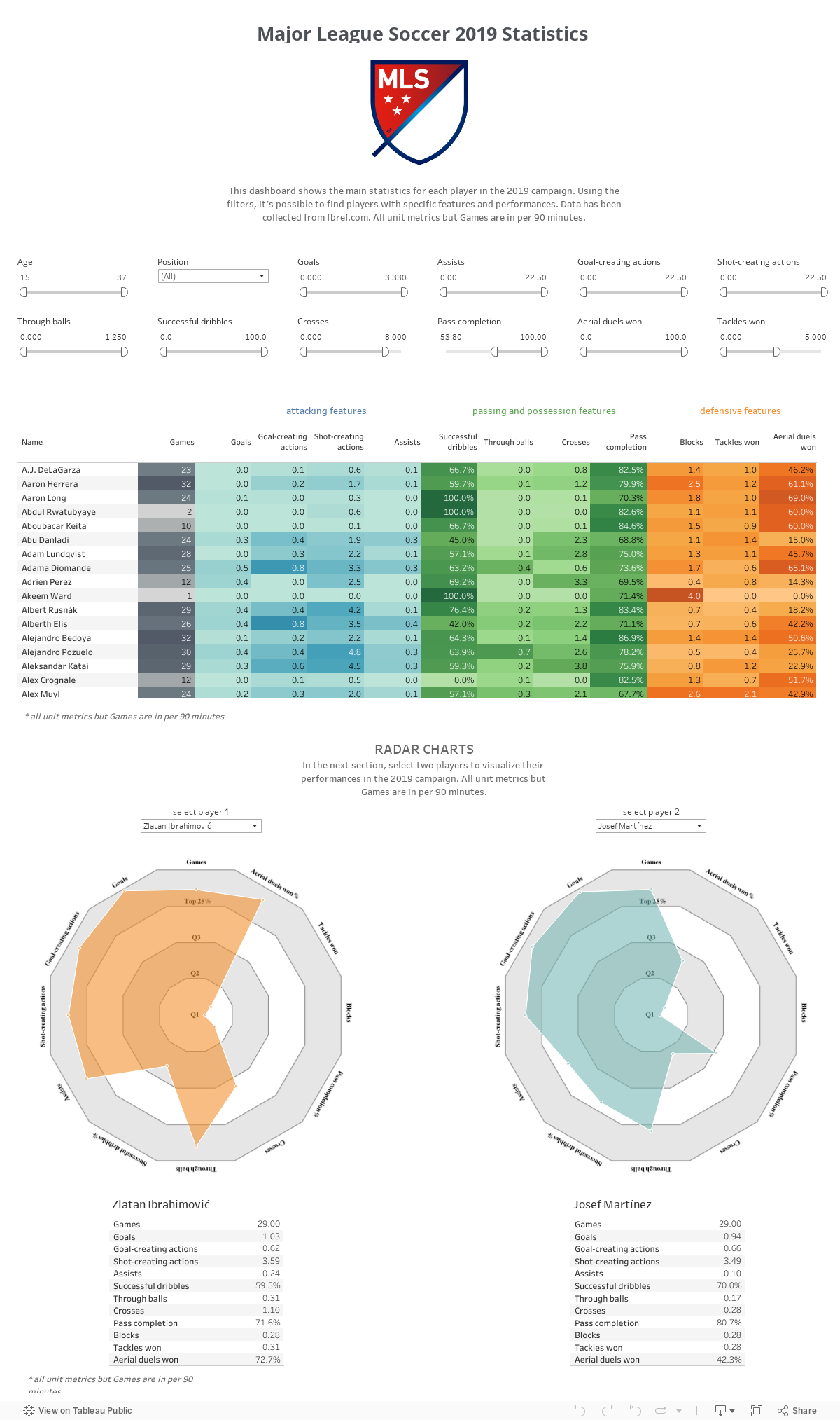
Data analytics in soccer is a growing and thrilling field. In this exercise, I used Python to scrape data about the 2019 MLS campaign from fbref.com. Then, I built a table with filters and radar charts to compare the performances of different players. A radar chart is a common tool in the professionals' daily work. For example, when it comes to scouting. 

The code: https://github.com/chrideki/MLS_2019

The Tableau dashboard: https://tabsoft.co/2UuOW0J


Monday, October 19, 2020

U.S. Presidential Debate

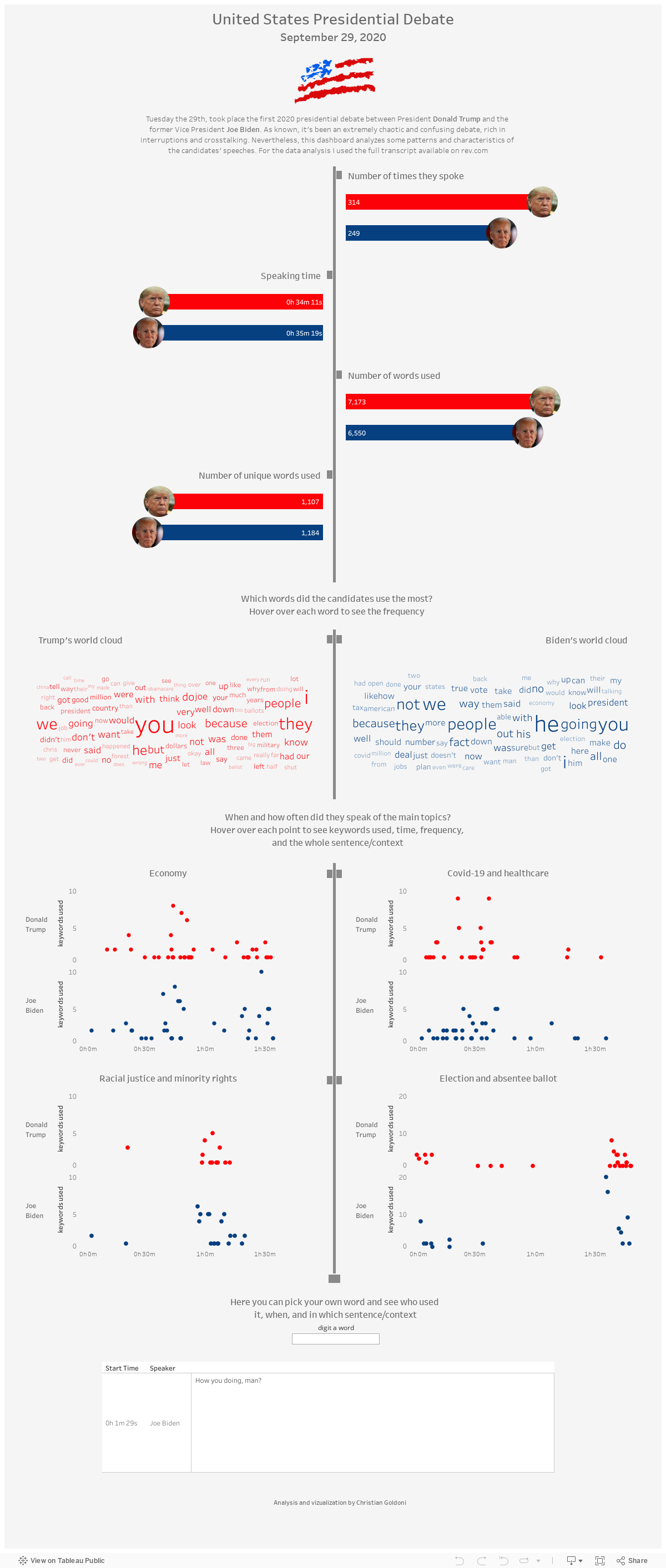
Tuesday the 29th, took place the first 2020 presidential debate between President Donald Trump and the former Vice President Joe Biden. As known, it's been an extremely chaotic and confusing debate, rich in interruptions and crosstalking. Nevertheless, this dashboard analyzes some patterns and characteristics of the candidates' speeches. For the data analysis I used the full transcript available on rev.com. Click here to see the dashboard and enjoy the Tableau interactions. 


Monday, July 27, 2020

U.S. Unemployment Rate

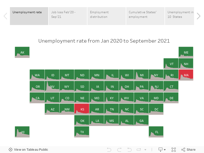
As known, unemployment is a big issue these days. I wanted to take a look at the data by State to see how things are doing across the country.
In this exercise, I made use of the API from the U.S. Bureau of Labor Statistics to get data about the unemployment rate in each State. The Python code I used to pull and manipulate data is available on github.
I'm so happy I learned how to create a tile grid map in Tableau, a very handful graph when it comes for example of political data. The Tableau file is available here.

Thursday, February 27, 2020

Census, the Low Response Score in NYC

The Census Bureau developed the Low Response Score (LRS) as a metric to identify the hard-to-survey areas. The higher the LRS value, the lower is the propensity to respond in the census. The following map represents the quantiles of the LRS, breakdown by tracts, in the five boroughs of New York. The darker tracts are the areas where is more difficult to get responses in the census. To create this map I made use of QGIS.

data source: census.gov